Intro
Carousell, a prominent online marketplace, facilitates connections between buyers and sellers across diverse categories. This case study centers on the redesign of Carousell's mobile application, specifically aiming to enhance the user experience from the buyer's perspective. We'll examine the challenges addressed, the strategic approach employed, and the resulting outcomes, all contributing to heightened user engagement and satisfaction within the Carousell platform.
The Problem
The buyer, a international car collector, faced several challenges in their purchasing efforts:
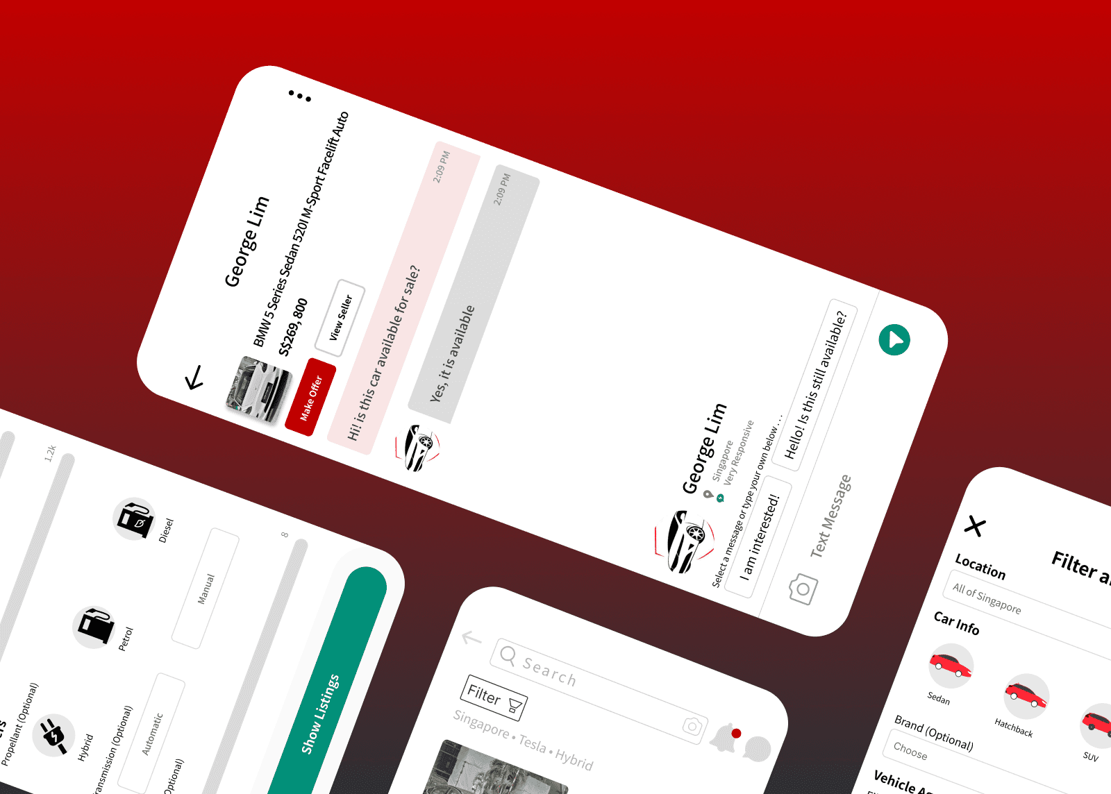
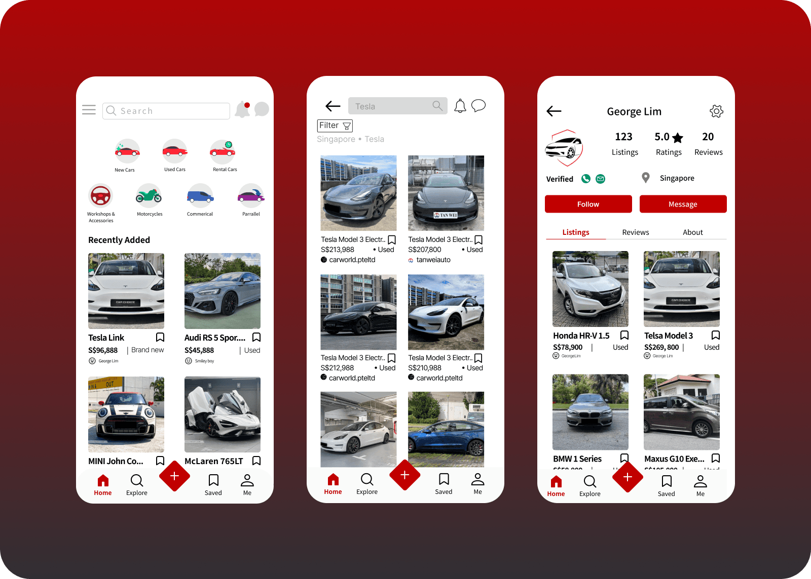
1. Limited Visibility on Listings: The international car collector faced challenges with listings lacking prominence, especially those marked with 'Spotlight' and duration indicators, which weren't readily visible to first-time users. Only images captured initial attention.
Uniform Button Design: The buyer encountered confusion with uniformly designed buttons for chat, purchase, and offers, lacking distinct visual cues.
Inconsistent Communication Icons and Categories: Complex shapes and colors of vehicle categories and UI icons led to ineffective communication, with no standardized consistency observed.
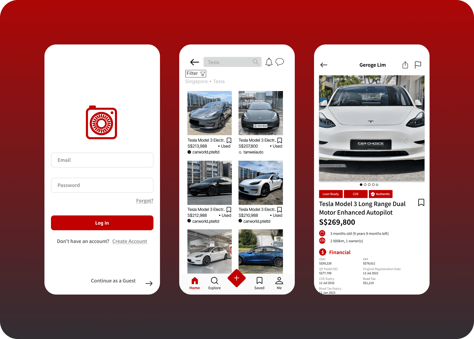
Redundant Tabs: The presence of redundant tabs, such as 'Top Picks' and 'For You,' presented navigation challenges as their content essentially overlapped.
Overwhelming Advertisement Presence: The application's usability was compromised by an excessive volume of advertisements, occupying nearly half of the screen space.
Limited Authentication for Luxury Purchases: The absence of authentication options deterred buyers from engaging in luxury purchases, affecting their confidence in transaction security.
Approach
I approached this project with a comprehensive strategy:
Decluttering information: Conducted in-depth playtests, focusing on users' goals to better understand how they navigate the application and identify pain points.
App Design and Development: Designed and developed a user-friendly, visually appealing, and mobile-responsive interface, highlighting the most relevant features and listings for buyers.
Content Optimization: Reshuffled categories and optimized icons and text placement, keeping the application clean and focused to captivate and inform users effectively.
Results
The Carousell project yielded several significant results:
Increased Online Visibility: The website significantly improved the bakery's online presence, attracting a broader audience and generating more leads.
Enhanced Customer Communication: The website incorporated contact forms and chat options, enabling efficient and organized communication with potential and existing customers.
Established Brand Identity: The new brand identity resonated more effectively with the recommerce marketplace's products and values. This strategic change enhances visual appeal, improves readability, and helps differentiate the marketplace in a competitive environment, creating a more cohesive and engaging user experience.
Conclusion
The Carousell project successfully addressed the challenges faced by buyers, resulting in a significant improvement in user experience and engagement. By redesigning the app to be more user-friendly, decluttering information, and establishing a strong brand identity with the color C10000, Carousell enhanced its appeal and usability. These changes helped Carousell grow its user base and improve buyer satisfaction. This case study illustrates the positive impact a well-executed UX/UI redesign can have on enhancing a platform's success in the competitive digital marketplace.